Harmony in interior design isn’t about matching everything perfectly or following rigid decorating rules. It’s about creating spaces where elements work together so naturally that the room feels effortless, balanced, and genuinely comfortable. Most homeowners can sense when a room feels “off”, furniture that’s too big, colors that clash, textures that fight each other, but pinning down what creates that opposite feeling, that seamless flow, takes understanding a few core principles. This guide breaks down how to achieve harmony in any room, using practical techniques that work whether you’re furnishing a studio apartment or renovating a whole house.
Key Takeaways
- Harmony in interior design means elements work together naturally to create balanced, comfortable spaces rather than matching everything perfectly or following rigid rules.
- Apply the 60-30-10 color rule (60% dominant, 30% secondary, 10% accent) and include at least three distinct textures to maintain visual interest without overwhelming the space.
- Use balance, proportion, and repetition of materials and colors to pull a room together—think echoing wood tones or repeating accent colors throughout connected spaces.
- Avoid common harmony-disrupting mistakes like pushing all furniture against walls, creating too many focal points, inconsistent metal finishes, or overloading patterns.
- Scale and arrangement are just as important as individual pieces—measure your room, leave adequate clearance, and float furniture to create conversation zones that enhance harmony.
- Edit your space regularly by removing pieces that don’t fit your color scheme or design vision, since accumulated items often break harmony more than enhance it.
What Is Harmony in Interior Design?
Harmony is the design principle that makes all elements in a room feel like they belong together. It’s what happens when color palettes, furniture styles, textures, and spatial arrangements support rather than compete with each other.
Think of it this way: a well-tuned guitar doesn’t mean every string plays the same note, it means all strings are adjusted relative to each other to create pleasing sounds. Interior harmony works the same way. You’re not duplicating the same chair six times or painting every wall the same shade. You’re selecting pieces that share visual connections, maybe a repeated material like oak, a consistent metal finish across light fixtures and hardware, or a color that appears in varying intensities throughout the space.
Harmony differs from unity (which is about cohesion within a single design scheme) and contrast (which adds visual interest through difference). All three work together, but harmony specifically addresses how smoothly your eye moves through a space without jarring transitions or confusion about what style the room is trying to achieve.
When harmony is present, rooms feel intentional rather than randomly assembled from leftover furniture and impulse purchases. When it’s missing, even expensive pieces can look disconnected and uncomfortable.
The Core Principles of Harmonious Interior Design
Balance and Proportion
Balance means distributing visual weight so a room doesn’t feel lopsided. There are three types: symmetrical (mirror-image placement, common in traditional design), asymmetrical (different objects with similar visual weight on each side), and radial (arranged around a central point).
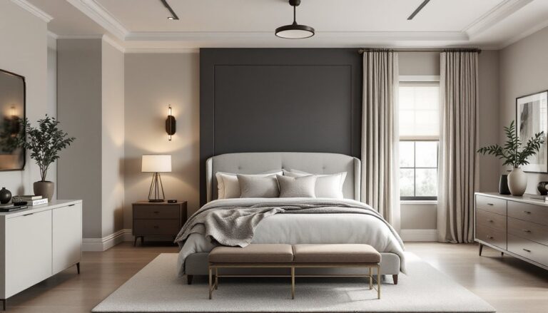
Symmetrical balance is the easiest to achieve and the most restful to the eye. Two matching nightstands flanking a bed, identical sconces on either side of a mirror, or a centered sofa with matching end tables all create symmetry.
Asymmetrical balance takes more finesse but feels more dynamic. You might balance a tall bookshelf on one side of a fireplace with a lower console and large piece of art on the other, different objects, but similar visual pull. Weight isn’t just about physical size: a small dark object can balance a larger pale one.
Proportion refers to how elements relate in size to each other and to the room itself. A sectional sofa that’s too large for a small living room throws off proportion, as does a tiny coffee table surrounded by oversized chairs. Use the rule of two-thirds as a baseline: a coffee table should be about two-thirds the length of your sofa, artwork should cover roughly two-thirds of the wall space above a piece of furniture it’s paired with.
Unity Through Repetition and Consistency
Unity pulls a room together by repeating certain elements throughout the space. This doesn’t mean everything matches, it means establishing threads that connect different pieces.
Material repetition is one of the most effective techniques. If your dining table is walnut, echo that wood tone in a console table, picture frames, or chair legs elsewhere in the room. Designers from Architectural Digest frequently recommend carrying one dominant wood species through connected spaces.
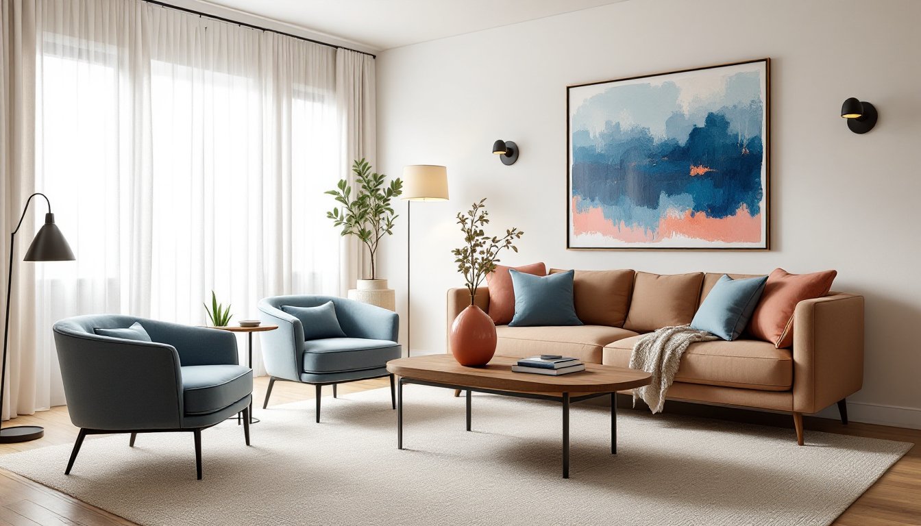
Color repetition works similarly. Pull accent colors from a patterned rug and repeat them in throw pillows, artwork, or a single painted accent piece. The repeated hue doesn’t need to appear in equal amounts, small touches are often enough to create visual rhythm.
Style consistency matters more than many DIYers realize. Mixing design eras can work beautifully (mid-century chairs with an industrial table, for example), but there should be a unifying thread, maybe it’s all angular lines, or all pieces share warm tones, or the mix itself is intentionally eclectic rather than accidentally mismatched. Trying to blend ultra-traditional Victorian pieces with sleek minimalist furniture rarely succeeds unless you’re very deliberate about transition elements.
How to Create Harmony Using Color and Texture
Color creates mood and connects disparate elements faster than anything else in a room. Start with a base palette of three colors: one dominant (usually walls or large furniture), one secondary (accents and medium-sized pieces), and one accent color for small pops.
The 60-30-10 rule keeps color balanced: 60% dominant color, 30% secondary, 10% accent. In practice, this might mean beige walls and a large neutral sofa (60%), blue accent chairs and curtains (30%), and coral throw pillows (10%). This ratio prevents any single color from overwhelming the space.
Temperature matters as much as hue. Warm colors (reds, oranges, yellows) advance visually and energize a space, while cool colors (blues, greens, purples) recede and calm. Rooms with rustic interior design often lean heavily warm to enhance coziness. Mixing temperatures works, but one should dominate, or the room feels confused.
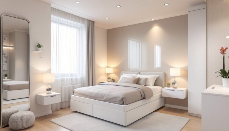
Texture adds depth without introducing new colors. A room done in all neutrals can still have tremendous visual interest through varied textures: a nubby linen sofa, smooth leather chairs, a chunky wool rug, velvet pillows, and a rough-hewn wood coffee table. Each material catches light differently and provides tactile variety.
Avoid the trap of too much visual similarity. An all-smooth, all-shiny space (think leather sofa, glass coffee table, silk curtains, polished chrome fixtures) looks cold and slippery. Balance smooth with rough, matte with gloss, soft with hard. Professionals recommend at least three distinct textures per room to maintain interest without chaos.
Achieving Harmony With Furniture Arrangement and Scale
Even perfect individual pieces can kill harmony if they’re the wrong scale or poorly arranged. Scale refers to the size of furniture relative to the room: proportion is how pieces relate to each other.
Measure your room before buying anything. A standard sofa runs 84–96 inches long. In a 12×12-foot living room (144 inches per wall), that sofa will dominate. In a 20×25-foot great room, it’ll look dinky. When furniture is too small, rooms feel unfinished and awkward: too large, and movement becomes difficult and sightlines get blocked.
Leave adequate clearance: 30–36 inches for major walkways, 14–18 inches between a coffee table and sofa (enough to set down a drink but still reach it comfortably), and 24 inches to pull out a dining chair.
Arrangement impacts harmony as much as the pieces themselves. Create conversation zones by angling chairs toward each other rather than lining everything against walls. Float furniture when space allows, pulling a sofa a few feet off the wall and placing a console table behind it creates depth and makes large rooms feel cozier.
Visual weight distribution prevents imbalance. If you have a heavy, dark entertainment center on one wall, balance it with something substantial on the opposite side, a large bookshelf, a gallery wall, or a tall plant in a chunky pot. According to design professionals, ignoring visual weight is one of the most common mistakes in DIY design.
Anchoring furniture with an appropriately sized rug helps define zones and pull pieces together. The rug should be large enough that at least the front legs of all seating pieces rest on it, ideally, all legs. A too-small rug floating in the middle of a furniture grouping breaks harmony rather than creating it.
Common Mistakes That Disrupt Interior Harmony
Pushing all furniture against the walls. This kills intimacy and makes conversation difficult. Pull pieces in to create defined zones, even in small rooms.
Too many focal points. A room should have one primary focal point (fireplace, large window, feature wall) and maybe one secondary element. Three bold accent walls, an ornate ceiling medallion, a massive gallery wall, and a statement light fixture all competing for attention creates visual chaos.
Ignoring lighting layers. Overhead lighting alone flattens a room. Harmony requires ambient lighting (general illumination), task lighting (reading lamps, under-cabinet strips), and accent lighting (highlighting art or architecture). Mix light temperatures carefully, stick with all warm (2700–3000K) or all cool (4000–5000K) bulbs in connected spaces. Mixing creates an uncomfortable, discordant feeling.
Inconsistent finish metals. Brushed nickel cabinet pulls, oil-rubbed bronze light fixtures, and chrome faucets in the same kitchen look unintentional. Pick one or two metal finishes and carry them through hardware, fixtures, and accessories. Mixing metals can work, polished brass and matte black, for example, but it requires purpose, not accident.
Neglecting scale in artwork and accessories. A tiny piece of art centered over a king bed looks lost. Aim for artwork that spans at least two-thirds the width of the furniture below it. Gallery walls should treat the entire grouping as one piece when considering scale. The same applies to accessories, one substantial vase often creates more harmony than five small tchotchkes crowding a surface.
Forcing a single design style too literally. The most harmonious homes layer elements rather than decorating as if from a catalog’s single page. Editors at Elle Decor regularly showcase rooms that blend eras and styles successfully because they share underlying principles, color palette, scale, or material quality, even when individual pieces differ stylistically.
Pattern overload disrupts harmony fast. Limit bold patterns to one or two per room, and make sure they share at least one color. If your curtains feature large florals, keep upholstery solids or subtle textures. Three competing patterns (striped rug, floral sofa, geometric pillows) rarely work unless you’re skilled at mixing prints.
Finally, skipping the edit. Rooms accumulate things over time, gifts, impulse buys, hand-me-downs. Harmony often improves by removing pieces that don’t serve the overall vision. If something doesn’t fit your color scheme, disrupts your room’s scale, or clashes with your style direction, it’s breaking harmony no matter how much you paid for it or who gave it to you.