Most rooms feel static because they’re built on a grid. Walls meet floors at right angles, tiles run parallel, and everything stays predictable. But diagonal lines break that rhythm. They pull the eye across a space, create the illusion of depth, and add energy without knocking down walls or buying new furniture. Whether it’s herringbone flooring, angled trim, or a diagonal paint stripe, these lines change how a room feels the moment someone walks in. This guide covers where diagonal elements work best, how to execute them without creating visual chaos, and the mistakes that turn dynamic into disjointed.
Key Takeaways
- Diagonal lines in interior design create visual movement and perceived depth by disrupting the static grid of horizontal and vertical elements, making spaces feel larger and more engaging.
- The most common applications for diagonal lines include herringbone flooring, diagonal tile patterns, angled wall treatments, and wood trim, each offering distinct aesthetic and functional benefits.
- Diagonal flooring increases material waste by 15–20% compared to straight installation, requires careful subfloor preparation with a 4-foot level, and installation direction significantly affects how a room’s proportions are perceived.
- Limit diagonal elements to one or two per room, maintain a consistent 45-degree angle, and test layouts with chalk lines or painter’s tape before committing to installation.
- Common mistakes that undermine diagonal design include skipping the layout phase, ignoring the room’s entry point, using multiple diagonal angles, and failing to account for material expansion or waste.
- Account for shifting shadow patterns and lighting effects when installing diagonal lines, as angled trim and paneling cast shadows differently throughout the day and emphasize imperfections more readily than flat surfaces.
Why Diagonal Lines Create Visual Impact in Interior Spaces
Diagonal lines disrupt the horizontal and vertical dominance of typical residential construction. Where walls, door frames, and windows establish a static grid, diagonals introduce movement and tension, in a good way.
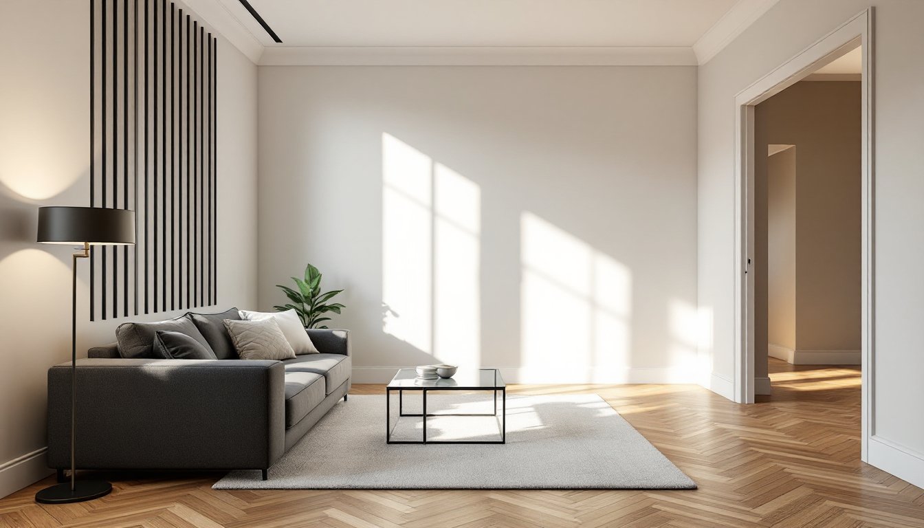
The human eye naturally follows lines. Horizontal lines suggest calm and stability. Vertical lines convey height and formality. Diagonal lines, by contrast, create momentum. They guide the gaze across a room rather than letting it settle, which makes spaces feel larger and more engaging. This is why a 45-degree herringbone floor feels more dynamic than straight plank flooring, even when both use the same material.
Diagonals also add perceived depth. When lines recede at an angle, they mimic perspective, the way railroad tracks appear to converge in the distance. This optical effect can make a narrow hallway feel wider or a low ceiling seem higher, depending on where the diagonal is placed.
Another advantage: diagonals draw attention without adding color or pattern. In a neutral room, a single diagonal element, a staircase with angled risers, a chevron accent wall, or even diagonal trim, becomes an instant focal point. It’s a structural design move that doesn’t rely on decor.
That said, diagonals work best when they’re intentional. Too many competing angles create visual noise. The goal is to use diagonals where you want movement, then balance them with the room’s existing grid.
Where to Incorporate Diagonal Lines in Your Home
Diagonal lines can appear in flooring, walls, trim, furniture arrangement, or even lighting fixtures. The key is choosing applications that enhance function, not just aesthetics.
Flooring and Tile Patterns
Hardwood, LVP, and laminate flooring laid diagonally is one of the most common applications. Instead of running planks parallel to the longest wall, diagonal installation runs them at a 45-degree angle to the room’s perimeter. This works especially well in square rooms, where it breaks up the boxy feel.
A few things to know before committing:
- Material waste increases. Diagonal layouts require more cuts, especially at walls and corners. Expect 15–20% waste, compared to 5–10% for straight runs. Factor that into your material budget.
- Subfloor prep matters more. Any dips or high spots become more obvious when planks run diagonally, because the eye picks up on misalignment more easily. Use a 4-foot level to check for flatness and apply leveling compound where needed.
- Install direction affects room proportion. Running diagonals toward the longest dimension makes a room feel more spacious. Running them across the short dimension can make a narrow room feel wider, but it also shortens the perceived length.
Tile is another strong candidate for diagonal layout. Classic 12×12-inch or 18×18-inch floor tiles installed on the diagonal (sometimes called “diamond” layout) add movement to entryways, kitchens, and bathrooms. Smaller tiles, like subway tile in a herringbone or chevron pattern, bring rhythm to backsplashes and shower surrounds.
One caution: grout lines multiply with diagonal patterns. That means more grout to apply, seal, and clean. If maintenance is a concern, go with larger tiles and tighter grout joints.
Walls, Wallpaper, and Paint Techniques
Walls offer more flexibility than floors because changes are easier to reverse. Diagonal treatments work particularly well as accent walls or in rooms where you want to experiment with bold geometry.
Diagonal paint stripes are a DIY-friendly option. Use painter’s tape to lay out stripes at a consistent angle, typically 45 degrees for balance. Two-tone or three-tone palettes work best: too many colors turn it busy. A mini roller helps with crisp edges, and removing tape while the paint is still slightly wet prevents peeling.
Wallpaper with diagonal patterns, chevrons, lattice, or abstract geometric designs, adds texture and depth without requiring structural changes. According to home design resources, diagonal wallpaper works especially well in dining rooms and powder rooms, where walls are the main visual event.
Wood trim and board-and-batten can also run diagonally. Install 1×4 or 1×6 pine boards at angles across a feature wall, then paint or stain. The result is a modern, architectural look that doubles as a sound buffer. Just make sure to hit studs with your fasteners, drywall anchors won’t hold angled trim reliably over time.
Shiplap or tongue-and-groove paneling installed diagonally creates a rustic, cabin-like aesthetic. This works well in dens, home offices, or accent walls in bedrooms. Use a miter saw to get clean angles at corners and edges: a circular saw can work, but you’ll spend more time sanding.
One often-overlooked application: ceiling treatments. Diagonal tongue-and-groove or beadboard on a ceiling draws the eye upward and makes a room feel taller. It’s more work than a flat paint job, but the payoff is significant in rooms with standard 8-foot ceilings.
Design Tips for Using Diagonal Lines Effectively
Diagonal lines are powerful, which means they can easily overwhelm a space if not balanced. A few guidelines help keep things grounded:
Limit diagonals to one or two elements per room. If the floor is diagonal, keep the walls and trim conventional. If you’re doing a diagonal accent wall, use straight flooring. This prevents the room from feeling chaotic.
Match the diagonal angle to the room’s architecture. A 45-degree angle is the most versatile and visually comfortable. Shallower or steeper angles can look forced unless they align with an existing feature, like the slope of a staircase or the pitch of a vaulted ceiling.
Use diagonals to guide traffic flow. In open floor plans, diagonal flooring can subtly direct movement from one zone to another. For example, running diagonals from the entryway toward the living area creates a natural path.
Consider scale. Thin diagonal lines (like pinstripe wallpaper) add texture but minimal movement. Wide diagonal stripes or bold chevrons dominate. Choose based on whether you want the diagonal to be a subtle accent or a focal point.
Test before committing. If you’re unsure how a diagonal will look, mock it up. For flooring, lay out planks without fastening them. For walls, use removable painter’s tape to simulate stripes or trim angles. Walk around the room at different times of day to see how light affects the lines.
Pair diagonals with simple furniture. Busy furniture shapes or bold patterns compete with diagonal architectural elements. Stick with clean-lined sofas, rectangular tables, and solid-colored textiles. Let the room’s structure do the visual work.
Use contrasting materials to emphasize the diagonal. A diagonal wood inlay in a stone floor, or diagonal trim painted a contrasting color, makes the line more intentional and less accidental-looking. Design showcases often highlight how material contrast amplifies geometric impact.
Account for lighting. Diagonal lines cast shadows differently than horizontal or vertical ones. Angled trim or paneling will create shifting shadow lines as daylight moves through the room. This adds depth but can also emphasize imperfections, so prep work (sanding, filling nail holes, priming) becomes even more critical.
Common Mistakes to Avoid With Diagonal Elements
Diagonal lines are forgiving in concept but unforgiving in execution. Small errors compound quickly.
Skipping the layout phase. Don’t start cutting or painting without a full-scale layout. For flooring, snap chalk lines to establish the diagonal grid. For tile, do a dry run to see where cuts will land. For wall treatments, use a laser level to ensure consistency. Eyeballing angles leads to drift, especially over long runs.
Ignoring the room’s entry point. The first thing someone sees when entering a room should be the cleanest, most complete section of the diagonal. Plan your layout so that cut edges and odd angles fall in corners or behind furniture, not front and center.
Using too many diagonal directions. One diagonal angle per room, that’s the rule. Mixing 45-degree flooring with a 30-degree wall stripe creates competing vectors that confuse the eye. Stick to a single angle and repeat it if you’re adding multiple diagonal elements.
Forgetting expansion gaps. Diagonal hardwood or LVP flooring still needs room to expand. Leave a 1/4-inch to 3/8-inch gap at all walls, hidden under baseboards. Diagonal layouts shift slightly differently than parallel runs, and without adequate gaps, you’ll get buckling.
Choosing the wrong substrate for angled tile. Diagonal tile requires a flat, rigid substrate. Cement board is the standard for wet areas. Drywall or plywood alone won’t cut it for diagonal layouts in showers or tub surrounds, where the leverage from angled cuts can cause tiles to pop off over time.
Not accounting for waste. Diagonals generate scrap. Budget for it. If a room needs 250 square feet of flooring, buy 300 square feet. If you’re working with patterned tile, order extra in case of breakage, replacements may not match future production runs.
Overcomplicating small spaces. In a tiny powder room or closet, a bold diagonal floor can feel overwhelming rather than dynamic. Save strong diagonal treatments for rooms where you have enough square footage for the pattern to develop and repeat.
Ignoring safety. Cutting angles requires repetitive use of miter saws or tile saws. Wear safety glasses and hearing protection. Angled cuts kick back differently than straight cuts, especially on a table saw. Use a push stick and keep fingers clear of the blade path.
Conclusion
Diagonal lines add energy and depth to interiors without requiring major structural changes. Whether it’s a herringbone floor, angled trim, or diagonal tile, these elements guide the eye and break up static layouts. The key is restraint, one or two well-placed diagonals per room, clean execution, and enough contrast to make the angle intentional. Plan the layout, account for waste, and let the room’s grid do the rest.