Retail interior design isn’t just about making a store look pretty, it’s about creating an environment that drives sales, builds brand identity, and keeps customers lingering long enough to open their wallets. Whether someone’s launching a boutique, renovating a café, or refreshing a showroom, the layout, lighting, materials, and colors all work together to influence buying behavior. For DIYers and small business owners tackling retail design on a budget, understanding the fundamentals separates amateur setups from professional-grade spaces that actually convert foot traffic into revenue.
Key Takeaways
- Commercial retail interior design strategically uses layout, lighting, colors, and materials to increase dwell time by 20-40% and directly influence customer buying behavior and sales performance.
- Effective traffic flow—achieved through grid, loop, or free-flow layouts—determines whether customers see 30% or 90% of available inventory, with aisles requiring 36-72 inches width depending on accessibility and congestion needs.
- Layered lighting combining ambient (30-100 foot-candles), accent, and task lighting maximizes product appeal, with LED retrofits cutting energy costs by 60-75% while delivering superior color rendering for increased sales.
- The 60-30-10 color rule balances retail spaces—60% dominant color, 30% secondary, 10% accent—ensuring brand psychology guides customer emotions without overwhelming the environment.
- Small business owners can achieve 70-80% of professional design impact by prioritizing high-impact zones like the entrance power wall, using budget-friendly materials like luxury vinyl plank, and phasing projects strategically instead of renovating entire stores at once.
What Is Commercial Retail Interior Design and Why Does It Matter?
Commercial retail interior design is the strategic planning and execution of a store’s physical environment to maximize customer engagement and sales performance. Unlike residential design, where comfort and personal taste lead, retail design prioritizes merchandising, traffic flow, brand messaging, and conversion rates.
The best retail spaces guide shoppers through a deliberate journey, from entrance to checkout, using visual cues, strategic product placement, and sensory triggers. A well-designed store can increase dwell time by 20-40%, directly impacting average transaction value. Poor design, on the other hand, creates bottlenecks, confuses customers, and sends them straight to competitors.
For small business owners, retail design isn’t optional luxury, it’s infrastructure. The space needs to work as hard as the staff. That means durable finishes that handle daily wear, flexible fixtures that adapt to seasonal displays, and lighting that makes products look irresistible under any condition. When renovation budgets are tight, focus on high-impact zones first: the entrance, main display wall, and checkout counter.
Key Elements That Make Retail Spaces Irresistible to Shoppers
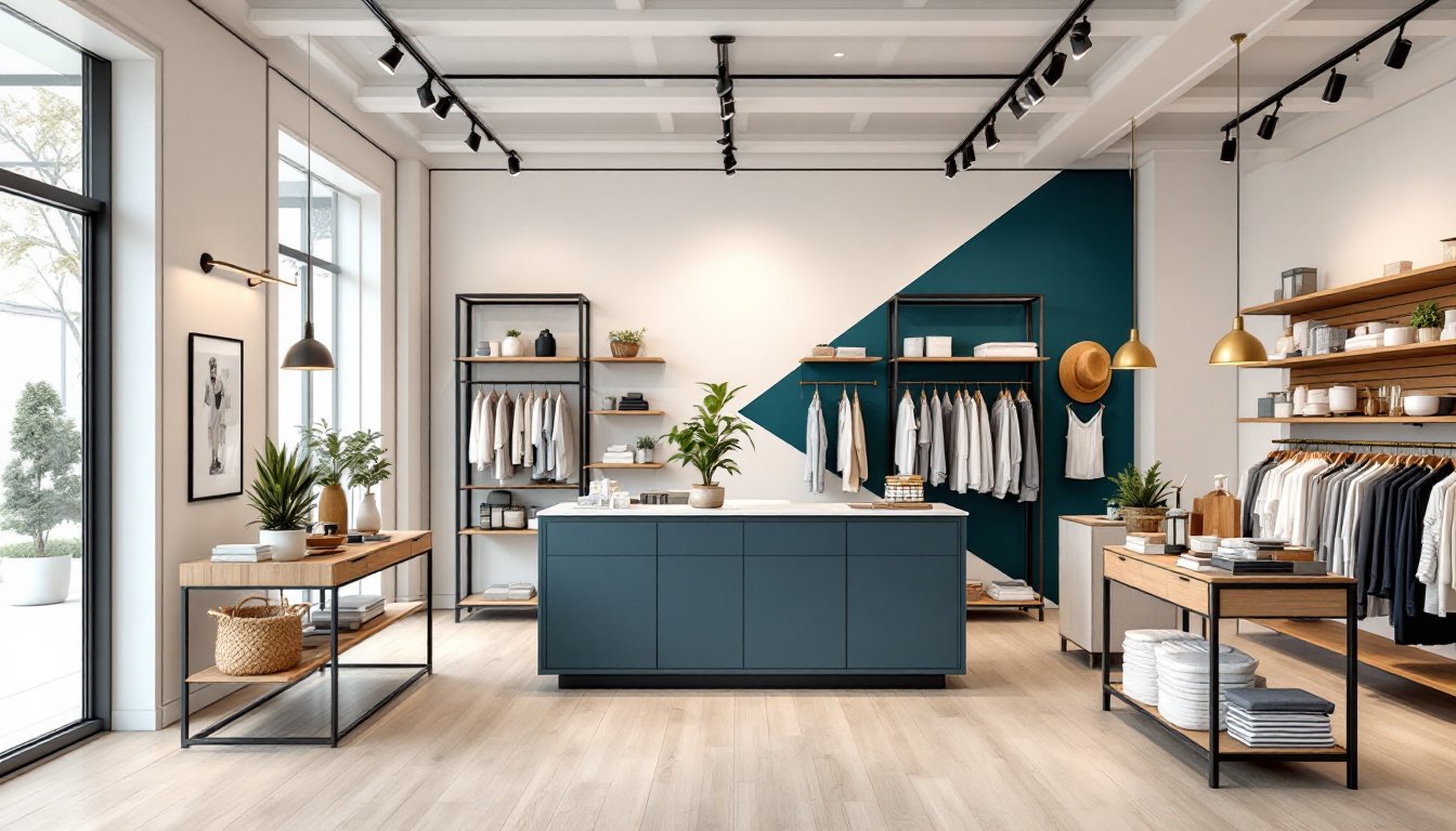
Layout and Traffic Flow Strategies
Traffic flow determines how customers move through a space, and whether they see 30% or 90% of available inventory. Most retailers use one of three proven layouts:
- Grid layout: Straight aisles maximize product density. Common in grocery stores and hardware retailers. Efficient for high-volume stock but can feel utilitarian.
- Loop (racetrack) layout: A main aisle circles the perimeter, with focal displays in the center. Forces customers past most merchandise. Works well for apparel and home goods.
- Free-flow layout: Asymmetric arrangement encourages browsing. Creates an intimate, boutique feel but requires careful planning to avoid dead zones.
The decompression zone, the first 5-10 feet inside the entrance, should stay clear of signage and displays. Shoppers need a moment to adjust and orient themselves. Place high-margin or seasonal products just past this zone where attention peaks.
For DIY renovations, test traffic flow with masking tape on the floor before committing to fixture placement. Walk the path a customer would take. If turns feel cramped or sightlines get blocked, adjust before anchoring shelving units.
Aisles should be at least 36 inches wide for single-person passage, 48-60 inches for wheelchair accessibility (required under ADA in the U.S.). High-traffic zones benefit from 60-72 inches to prevent congestion during peak hours.
Lighting Design for Product Showcase and Ambiance
Lighting does double duty in retail: it highlights merchandise and sets emotional tone. Most successful stores layer three types:
- Ambient lighting: Overall illumination from recessed fixtures, troffer lights, or track systems. Aim for 30-50 foot-candles in general retail areas, 50-100 foot-candles in high-detail zones like jewelry or cosmetics.
- Accent lighting: Directional spots or track heads that create focal points. Use a 3:1 ratio, accent lights should be three times brighter than ambient levels to draw the eye.
- Task lighting: Focused light at checkout counters, fitting rooms, or service desks. Prevents eye strain and signals functional zones.
Color temperature matters. Warm white (2700-3000K) creates cozy, inviting environments for apparel and home goods. Cool white (3500-4100K) suits tech stores and modern boutiques. Daylight (5000-6500K) works for art galleries or spaces where color accuracy is critical.
LED retrofits make sense for most small retailers, they cut energy costs by 60-75% and last 50,000+ hours. When replacing fluorescent troffers, consider LED panels with high CRI (Color Rendering Index) of 90+. Poor CRI makes fabrics and finishes look dull, directly hurting sales.
Dimmers add flexibility, allowing staff to adjust ambiance for different times of day or special events. A café might use brighter light during morning rush, then dim for evening atmosphere. Install commercial-grade dimmers rated for LED loads: residential units often cause flickering with retrofit bulbs.
How to Choose the Right Color Palette for Your Retail Brand
Color psychology influences buying behavior more than most retailers realize. Fast-food chains use red and yellow to stimulate appetite and urgency. Luxury brands favor black, white, and metallics to signal exclusivity. Discount retailers lean on bright primaries to communicate value and energy.
Start with brand identity, then adapt for the space’s function:
- Warm colors (red, orange, yellow): Create energy and urgency. Use in sale areas or impulse-buy zones. Too much can feel chaotic.
- Cool colors (blue, green, purple): Promote calm and trust. Work well in wellness, tech, or professional service environments.
- Neutrals (white, gray, beige, black): Provide a clean backdrop that lets products dominate. Essential for fashion and home décor retailers.
The 60-30-10 rule keeps palettes balanced: 60% dominant color (usually walls and large surfaces), 30% secondary color (fixtures and accents), 10% accent color (signage and small details).
For DIY paint projects, test samples on multiple walls and observe them at different times of day. North-facing spaces skew cool: south-facing run warm. LED lighting can shift color perception, so evaluate samples under the actual fixtures that will be installed.
Paint sheen affects durability in commercial spaces. Flat and matte hide imperfections but show scuffs. Eggshell or satin balances aesthetics with cleanability, critical in high-traffic retail. Semi-gloss works for trim and high-touch areas. Most commercial paints cover 350-400 square feet per gallon: plan on two coats for even color.
Many modern design trends emphasize bold accent walls or biophilic color schemes that bring natural greens and earth tones indoors, which can work particularly well for wellness or eco-focused retail brands.
Material and Fixture Selection for Durability and Style
Retail finishes take a beating, foot traffic, shopping carts, product spills, and constant fixture adjustments. Materials need to look good and survive years of hard use.
Flooring sees the worst abuse. Options by use case:
- Luxury vinyl plank (LVP): Waterproof, scratch-resistant, and affordable. Available in wood and stone looks. Handles heavy traffic and comes in commercial grades rated for Class 32 or higher.
- Polished concrete: Extremely durable, modern aesthetic. Requires professional grinding and sealing. Can be cold and loud without area rugs or acoustical treatments.
- Porcelain tile: Ideal for wet areas or food retail. Choose textured or matte finishes over glossy, slippery tiles are a liability risk.
- Commercial carpet tile: Modular design allows spot replacement. Look for high-density nylon with built-in stain resistance. Not suitable for food service.
For DIY installs, LVP with click-lock systems offers the best balance of ease and performance. Acclimate planks in the space for 48 hours before installation. Subfloor prep matters, level to within 3/16 inch over 10 feet, or joints will gap.
Fixture selection depends on merchandising needs and budget. Slat wall offers maximum flexibility for hooks and shelves, but can look generic. Custom millwork creates a unique brand experience but costs 3-5x more. Modular shelving systems split the difference, adjustable, professional, and available through commercial suppliers.
When browsing platforms like Houzz for design ideas, note that residential fixtures rarely meet commercial durability standards. Look for powder-coated steel, solid wood (not veneered particleboard), and adjustable components.
Wall finishes need to resist scuffs and allow for easy updates. Satin or eggshell paint works for most applications. High-impact zones benefit from wainscoting, FRP (fiberglass reinforced panels), or tile up to 48 inches. In dressing rooms, add chair rail or corner guards at cart height to prevent drywall damage.
Budget-Friendly Retail Design Tips for Small Business Owners
Professional retail design firms charge $75-$150 per square foot for full build-outs. Small business owners can achieve 70-80% of the impact at a fraction of the cost by prioritizing smart investments.
Focus on the “power wall”, the first vertical surface customers see after entering. This is prime real estate for hero products, brand messaging, or seasonal displays. A fresh coat of paint, accent lighting, and well-styled shelving here outperforms mediocre finishes spread across the entire store.
DIY what you can, hire what matters. Paint, assembly of modular fixtures, and basic trim work are manageable for handy owners. Electrical, plumbing, and anything structural should go to licensed pros. Most municipalities require permits for electrical upgrades, new lighting circuits, or structural changes. Skipping permits risks fines and complicates insurance claims if something goes wrong.
Shop secondhand and surplus. Restaurant supply stores, architectural salvage yards, and commercial liquidators sell quality fixtures at 40-70% off retail. Inspect carefully for damage and verify dimensions before hauling.
Use paint strategically. A bold accent color or geometric pattern on one wall creates visual interest for under $100 in materials. Refresh trim and ceilings, dingy white overhead kills ambiance no matter how nice the displays look.
Lighting upgrades deliver outsized ROI. Swapping outdated fluorescent strips for LED panels ($40-$80 each) instantly modernizes a space. Adding track lighting ($150-$300 for a basic kit) lets owners spotlight key merchandise without permanent fixture changes.
Keeping an eye on urban retail trends can spark ideas for adaptive reuse or cost-effective material choices that feel current without blowing budgets.
Phase the project. Tackle the entrance and main sales floor first. Back-of-house areas and storage can wait. Customers judge the business by what they see, not what’s behind the curtain. A phased approach also spreads costs over multiple quarters and allows for adjustments based on what works.
Test before committing. Use removable vinyl decals for signage, paint samples for color tests, and temporary fixture arrangements. Moving a 6-foot shelving unit after it’s loaded with inventory and bolted to the wall is miserable. Get the layout right with lightweight mockups first.